Who we are!
Nzeni Digital is a modern, unique and mobile marketing agency. We draw inspiration from our new-age African aesthetic, roots and creativity we were born into. An agency dedicated to your success, wherever and whenever you need us. Founded by Niel Themba van den Burg, the agency strives to develop creatively unique branding, design and social campaigns to improve your relationship with your closest customers.
At Nzeni we pride ourselves on our connection to the latest techniques and trends in Creative production and Social management. We are the perfect small-scale agency to drive traffic to your brand’s assets, develop influencers and promote the craziest events! We keep the ear to the ground, so you don’t have to.
NZENI DIGITAL
Coyotl Group UK Beverage Importing Online Store
Project overview
THE PRODUCT: Coyotl Group CMS Ecommerce store
An online store built from the ground up. This included brand conceptualisation. The website needed to facilitate purchases, client communication, CMS and order management.
Project Duration
August - December 2022

THE PROBLEM
Coyotl Group’s customer base is not growing rapidly enough due to the lack of a centralised online platform to showcase and sell the businesses imported products.
THE GOAL
The goal is to build a website that is easy to use, simply designed and makes managing the business easier by automating most of the purchase journey.
MY ROLE
Full end to end build. UI Designer, User Researcher, Web Developer, Brand strategist
RESPONSIBILITIES
-
Requirements Study & Platform scoring
-
Usability Study
-
UI Mockup design & iteration
-
Client communication
-
Website build & testing
Understanding the User
User research summary
Research was conducted to determine if users can complete a store browse journey that ends in purchase within reasonable time and without guidance.
To evaluate how users experienced the platform, an unmoderated usability study was conducted to generate qualitative information.
8 participants were interviewed for approximately 10 minutes to gain qualitative data about the platform. This includes challenges, potential features and breaks in the journey that customers may experience.
User research: pain points
Lack of Interactibility
Not enough of the buttons and features on the site have interactable features including smooth transitions.
Slow Load
Users experienced low website speeds which demotivated from completing purchases.
Restrictive Payment Methods
Users expressed the pain of finding websites that do not support multiple payment mechanisms such as paypal. Useful for an international import company.
Security
Security of Payment method and availability of multiple payment methods.
Persona generation
Jeff is a part time bar owner
who needs simple way to order his favourite artisanal drinks
To keep his bar in business and still attend to his other jobs.
-
Age: 45
-
Education: High school completed, some higher education or more
-
Hometown: London UK
-
Family: Has older children who have left the house
-
Occupation: Office job, Artists and Artisans, travels for work
-
Goals: Find new simple pleasures and new experiences without too high a cost. Goal of using the store is to experience mexican products and culture. To deviate away from normal british consumption habits.
-
Frustrations: All brands are the same, taste the same, not enough differentiation.
User Journey Map


Design procedure
Paper wireframes
The goals were to make the simplest user flow and the shortest checkout process possible while still leaving areas for exploration of the other unique products on offer to expand the breadth of what 'Artisanal' means for the customer
Digital wireframes

This Wireframe was to begin ideation of the mechanism for the Portfolio page would look like.
The portfolio would showcase the premier products and best sellers that Coyotl group was importing.
The concept uses a Z-Shape design to create a dynamic design of content to keep customers engaged while guiding the eye across the page.
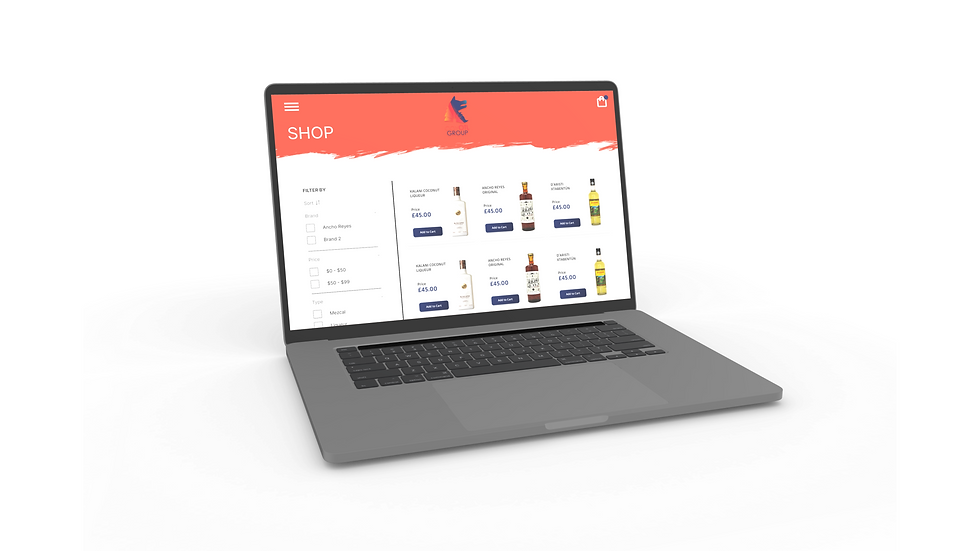
The Shop has more of a utilitarian design concept with sort functions on the left and large product cards which would expand to show the full description of products.
The Sort functions needed to be tested thoroughly with users to find out which feature tags will dictate the sort functions


The recipes page in addition to the news page act as a content generation mechanism that will drive additional traffic to the store.
The design here was to follow a gallery layout with each card using a hover function to show the full recipe.

Usability Study
An unmediated Usability Study was conducted with prompts asking the user to place an order and were timed on checkout time. The first study would determine if users can complete core tasks within the prototype of the Coyotl group web store. And determine the elements of purchase or order facilitation that are difficult to use or unappealing

Mockups

The first iteration designs provided a strong guide for the the layout of the high fidelity mockups and the Z Gallery style design worked well to illustrate the story of the company on the landing page.


The usability study showed that indicated that the portfolio needs more dynamic colours that allowed the products to work with the overall aesthetic without dominating over accent colours.


Catalogue and purchase user flow for the shop mechanism

Letting the cocktail recipe content speak for itself. Use muted and accented website colours and allow the colours in images to brighten the page.

Who we are stories needed to introduce the new enterprise and create a brand story before purchase.
Catalogue and purchase user flow for the shop mechanism
Overall this site was simplistic in its design and purpose;
The focus was to promote the business' main brand and value story. And use this as a vehicle to drive sales conversions.
The website would be used to tandem with other digital marketing vehicles to increase engagement and brand community building.
This was achieved through the aesthetic of the brand.
High fidelity prototype
The final high fidelity prototype presented cleaner user flows for browsing each product on offer currently importing from Mexico.
The prototype was used to functionally determine if the logic works before developing e-commerce site. And if any logic paths do not make sense.

Accessibility considerations
Colours were selected based on high contrast between accent and background. These colours aligned with the company logo gradient.
Each image and product is aligned and contained with a description of the image for those who need screen readers.
The page's primary product is alcoholic products among others. This required an age gate feature before entering the website.
Takeaways
IMPACT
the app makes users feel like they are learning more about a different culture while ordering their product.
The website will serve to promote the brand's company story and values since it is a new business. The company needs to sell itself before selling a product.
WHAT I LEARNED
I learned that many navigation issues may arise from users who have different approaches to using applications. This includes people with different disabilities or varying computer literacy.
Content that will increase site visits needs to align aesthetically and functionally with product purchase flows.
Next steps
Continue iterating after development. UX is a continuous journey. We can learn more from additional usability studies.
Adding new products and recipes into the design with additional cultural history and information. This will need to be applied with additional marketing campaigns.
Include a help page and chatbot for support capacity for completing orders